The dangers of custom accessibility
As developers, we often want to make the cleanest, most efficient user interface. The app should present the most important information as quickly as possible and make it easy to navigate around. We're focused find ways to make everything even easier, by reducing friction and unnecessary interactions as much as possible.
This approach also leaks into our accessibility efforts, even when it might be bad for the experience instead.
The 'problem': VoiceOver feels inefficient
VoiceOver usually goes over UI elements in a 'top to bottom' and 'left to right' order and tries to focus on each item that might be important to people to understand the screen. For example, in a list with multiple sections, that would go something like this;
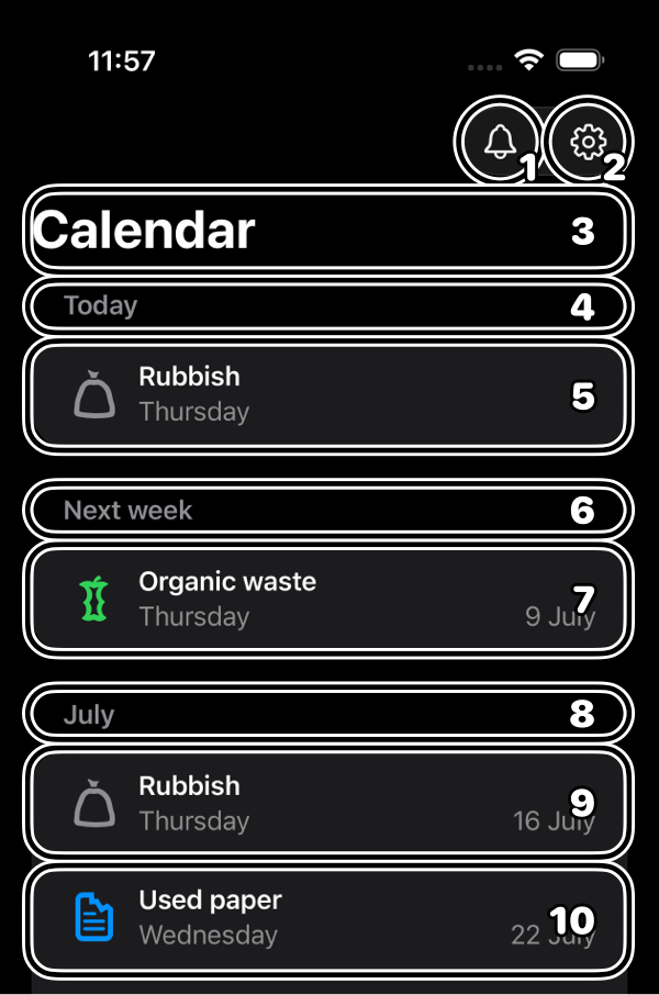
Each section title will be focused on separately, before the focus moves on to the rows in that section. This is completely valid and highly encouraged. But it often feels inefficient. Why am I wasting an interaction just to hear "Today, heading" instead of going immediately to "Today, Rubbish, Thursday, heading"?
The solution: Combine the header and row
You might want to solve this by combining the section header and the row as a single focusable element. This means that after the screen's title, people can immediately focus on the next pickup and the one after that, without unnecessary stops in between!
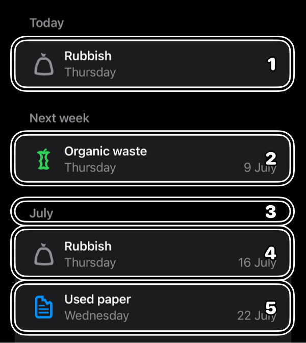
We can even keep the header trait intact! All the wins of more efficient navigation, without any of the drawbacks!
Looking back: Pros and cons
Combining the section header and the single row into one element helps people with getting to the important information with as little effort as possible. But this does mess with the default accessibility. People might always expect a section title to be a separate header element, before going to the section's content.
So what are the pros and cons for this custom accessibility?
- ✅ Pro: Quicker navigation.
- ✅ Pro: Immediate focus on the most important information.
- ❌ Con: Combining section headers with rows is unexpected.
- ❌ Con: Headers suddenly have a lot of content.
- ❌ Con: Page structure might change between sessions.
Especially the last drawback can weigh heavily, since consistency is often crucial to learning how to use an app. But let's say we decide that the advantages are still worth it. Let's test this.
Testing: Combining accessibility features
Custom accessibility can seem like a good idea, especially when we're solving an annoyance in the app's daily use. But we can forget about people that enable not one accessibility feature, but two or maybe even more. For example, what happens if someone that has VoiceOver, also set their text to a very large font size and maybe even has Zoom enabled?
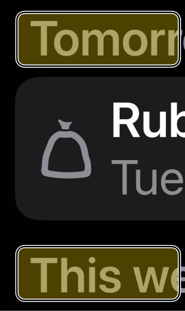
Now the headers, which are not focusable anymore, take up a large portion of the screen. And that means we've disabled a big chunk of the screen's interactivity which someone might need.
Yikes! 😬 This is bad enough to scrap the custom accessibility and keep the standard behavior instead.
Conclusion: Back to basics
We've found out that solving a minor annoyance for people using VoiceOver, would break the app for other people instead. In this case, keeping SwiftUI List's standard behavior keeps the app predictable and usable in all cases.
This doesn't mean that custom accessibility is always bad. But if you need to customize your app's accessibility, make sure the benefits outweigh the drawbacks. Test, test some more, and test accessibility features in combination. Don't be afraid to scrap work. And when in doubt (read: always), verify with your target audience! Talking with people that use the screenreader and other accessibility features is always great 😄